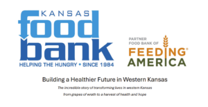

How to create visual cohesion in a fundraising campaign.
Current psychology research suggests that the average human needs to see the same image five to seven times to remember it. That’s a lot! What that means for our work in a fundraising campaign is designing touchpoints that visually speak to donors in a consistent and concise manner.
How would you feel if, in the middle of a conversation with someone, they suddenly shifted tone out of nowhere or even changed languages? That would be confusing, right?
Well, we want to avoid making donors feel this way when they interact with materials from a single campaign. We can do that by aiming for campaigns that use the same visual language at every touchpoint.
So, how do we create a consistent visual language to work from?
There’s not exactly a one-size-fits-all answer to that question but knowing some of the basic visual elements is a good starting point. Basic elements of a campaign’s visual language include things like typography, color palette, and photography or illustration styling.
To create cohesion within these elements, here are some simple tips to consider.
Typography
Are all the fonts used in a similar way, including their size, weight, and color across all pieces?
Consider whether the type is readable to your audience, especially for older donors. Also, ask whether the typography is appropriate in tone with your messaging overall.
My tip here is to check for consistency in the type being used throughout all your campaign pieces.
Color Palette
We need to consider whether the colors chosen will work for all touchpoints throughout a campaign’s lifespan, including print and digital mediums. Sometimes vibrant colors on a screen don’t translate well in print, and vice versa, so those are factors that might affect your color choices.
Other things to consider include whether the color palette is at an appropriate contrast level for donors and whether it’s in harmony with other factors driving your message, like holiday- or season-specific themes in your campaign.
Photography and Illustrative Styling
Look at how the photography or illustrations interact with the tone and messaging of the overall campaign. Are they in harmony?
For example, using all children’s photography or illustration for a senior hunger campaign creates discord, even if the colors and type styles are consistent.
Also consider whether all the photography or illustrations match each other contextually, with things like seasonal elements in the background or on your subject.
Overall, a good rule of thumb is to look at all your campaign pieces together and check that they appear to be speaking with the same voice from the same organization.
These are just a few simple tips that can significantly impact the visual consistency and cohesion of a fundraising campaign.
Remember: we want donors to not only understand our campaign but also remember it and be inspired by it.
So, whether it’s a Facebook ad, a direct mail piece, or a giant billboard, we want to ensure that donors are seeing the same visual language for the campaign at every step along the way.